
AUG 2023 - NOV 2023
Product Design
IOS App
Internship
Supporting Fuelin’s V2 launch by evolving agency-led designs into scalable, developer-ready user experiences


Fuelin is the world’s first training-based nutrition app that helps triathletes optimize daily nutrition, recovery, and performance for triathletes based on their training schedule. It integrates seamlessly with platforms like TrainingPeaks, TriDot, Humango, and Final Surge, while also supporting manual input for full flexibility.
FUELIN AT A GLANCE
Fuelin is the world’s first training-based nutrition app that helps triathletes optimize daily nutrition, recovery, and performance for triathletes based on their training schedule. It integrates seamlessly with platforms like TrainingPeaks, TriDot, Humango, and Final Surge, while also supporting manual input for full flexibility.
MY ROLE
Brought in as a Product Design Intern during a critical growth phase at Fuelin, I joined the team as they transitioned from agency-led design to internal product ownership—during the final stages of a major version redesign: Fuelin 2.0
Quickly ramped up, designed key screen enhancements, and extended existing design system, enabling the team to rapidly ship key updates under a tight launch deadline. Systematized processes to keep all app screen designs consistently up-to-date delivering designs with modern aesthetics and improved usability aligned with Fuelin's brand.
Other Contributions
THE CHALLENGE
Fuelin’s mission was to democratize elite-level nutrition — delivering smart personalization at scale without overwhelming everyday users.
The app, while feature-rich, presented a few key UX challenges:
Low discoverability of critical features like food logging and weight tracking
An inconsistent design language between legacy and newly added components
Friction in core workflows, especially syncing with third-party training platforms
A lack of clear fallback states when content failed to load or sync
FOOD LOGGING


Before
After
The original macro rings lacked visual feedback — all rings were dark grey with low-contrast text.
Users couldn’t quickly interpret the distinction between hitting, missing, or exceeding their macro targets.
Main
Macro Rings
Tab
Scooter AI
Empty States
Top Bar Simplification
ATHLETE PROFILE

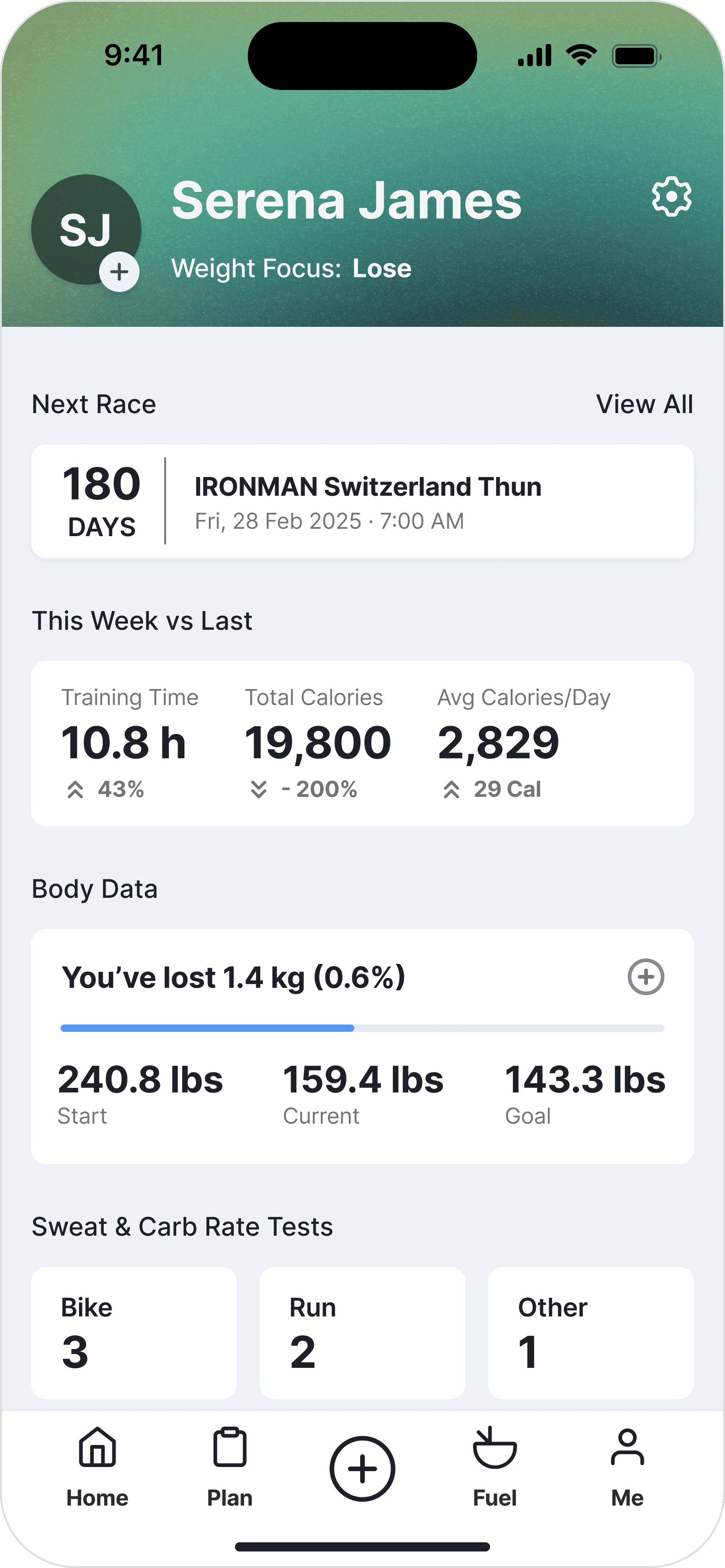
The Athlete Profile acted as the user’s “home base” for personal goals and health metrics. However, it lacked personalization and forced users to navigate into settings to access and interpret manage weight goals.
Main
Profile Image
Weight History
Delete Entry
MY CONNECTIONS

As part of improving Fuelin’s integration with third-party platforms, I worked on refining the “My Connections” experience to support more intuitive data syncing and customization.
Main
Bottom Sheet
Advanced Setting
NAVIGATION


To improve task efficiency and align the interface with user priorities, I redesigned both the bottom navigation bar and the logging modal, turning them into more actionable, intuitive components.
These are two of the most frequently used elements in the app, and the changes directly supported Fuelin’s goal of reducing friction in daily flows.
Main
Nav Bar
Quick Log
ERROR & LOADING STATES
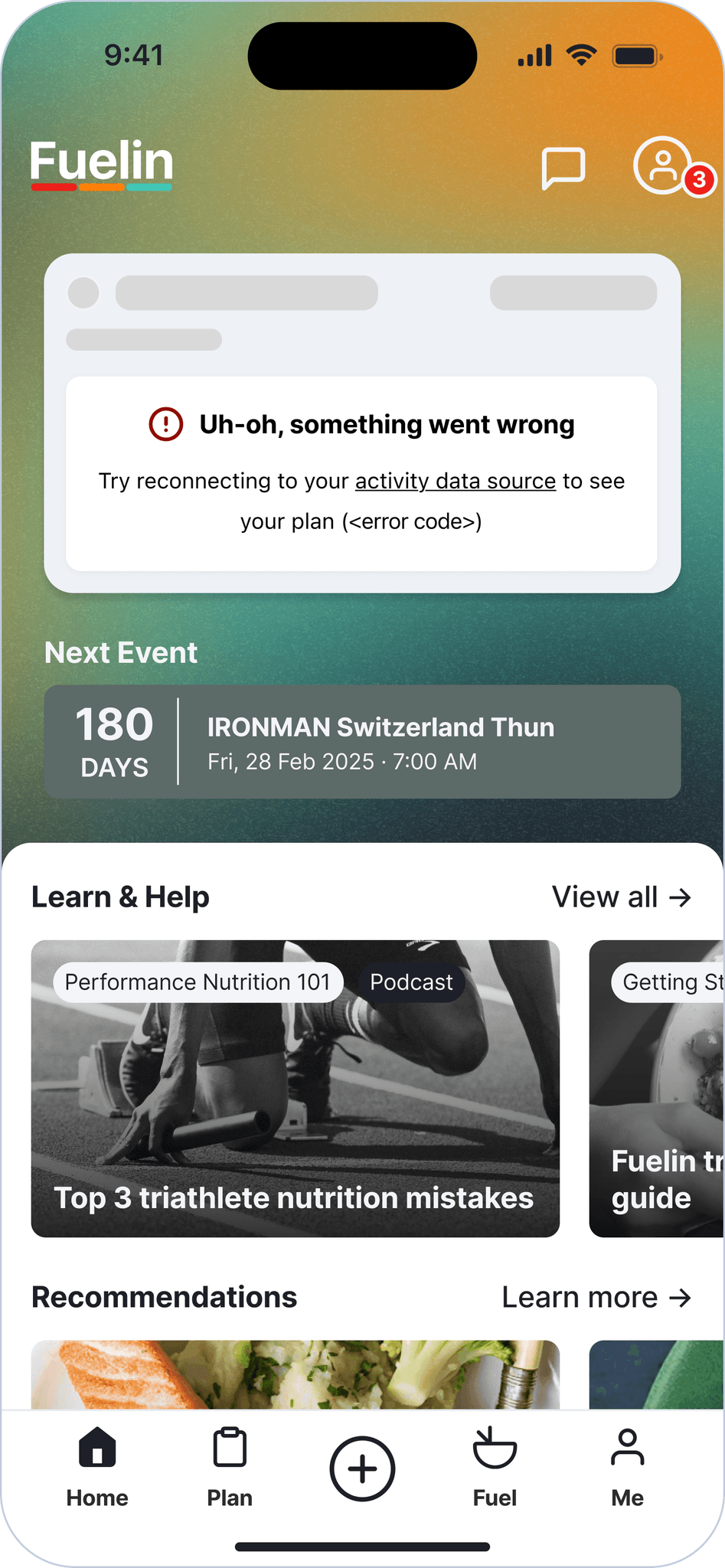
Before
After
When the app failed to fetch data (e.g., no internet or third-party sync failure), users were shown either blank screens or vague system errors.
Check out these screens through the top nav bar
Main
Plan Screen
Fuel Screen
Athlete Screen
User & Stakeholder Feedback
Throughout the design process, I worked closely with the Co-founder/CEO, who regularly synthesized feedback from athletes, Fuelin coaches, and early beta testers. While I didn’t conduct the interviews myself, this feedback directly informed several of my redesign decisions.

It takes too many steps just to log something. I wish I could do it straight from the home screen.

-Beta Athlete
This directly inspired the Quick Log modal and central ⊕ button in the redesigned nav bar, helping users take action with fewer taps.
I didn’t even notice that I could type in what I ate — but once I did, it was the easiest part.
-New User Feedback
This insight validated the need for better discoverability in food logging. I addressed this through improved input positioning and visual clarity in the logging UI.
Post-Redesign Feedback
The new layout feels cleaner and more high-end… it’s just easier to use.
- Internal Feedback
This quote came after the shift towards a more polished, intuitive interface, affirming the visual and UX enhancements made across key screens were aligning with Fuelin’s identity as a premium performance tool.
Reflections & Learnings
My internship at Fuelin was an incredible opportunity to contribute meaningfully to a real-world product challenging me to think beyond individual screens and focus on building cohesive, scalable product experiences.
I pushed my boundaries by working on everything from mobile UI redesigns to dynamic PDF templates using Builder.io—and even created a virtual Fuelin T-shirt asset for a TrainingPeaks game. Being in a fast-paced startup taught me to prioritize ruthlessly, think end-to-end, and design with both user needs and engineering feasibility in mind.
As someone who naturally leans toward over-iteration, this experience helped me strengthen my design judgment. With Jonathan’s (CEO) guidance, I learned to trust my instincts, focus on what truly improves the user experience, and avoid over complicating flows with redundant features.
I also got the chance to collaborate with a globally distributed team—co-founders from San Francisco, Australia, and New Zealand; developers based in Costa Rica and the Philippines. It was my first time working in such a diverse setup, and it strengthened my ability to communicate clearly, stay aligned across time zones, and adapt to different working styles.
What I take with me:
Design less for perfection, more for clarity and usability
Fast iteration is powerful—but only when grounded in real user needs
Constraints are your collaborators, not your enemies
And great UX isn’t always about adding more—it’s about knowing what to remove